You have your company. You have your vision and mission – what’s next? Creating a website that attracts and engages customers is an important step in growing your business. However, it’s important that you create a site that isn’t just aesthetically pleasing but usable and directed. Let’s look at how we take web design principles and use them to help convert website visitors into customers.
Principles of Web Design: User-Focused Sites
From the World Wide Web Consortium (the international community that helps creates web standards) to digital marketing professionals like Media Components, everyone agrees on one important design concept for websites: they must be user-focused. When we design a website, we consider how you want to engage with your audience and then how that audience will move along your website.
User Friendly or User Focused
We use the terms user-friendly and user-focused interchangeably, but they’re not the same thing. User-friendliness focuses more on the aesthetic designs of a website. User-focused, on the other hand, looks at the usability of the website. Both are important aspects of design, as you want your website to be appealing, inviting, and engaging (user-friendly) while also being intuitive with clear indications of how a user should and can engage with the site (user-focused). Since we’re looking at converting visitors to customers, we’ll be focused on the user-focused aspects of web design.

Prioritizing a User-Focused Design Into Your Site
Now, let’s look at the web design principles that are most important to converting visitors to your site into customers.
Support Multiple Devices and Platforms
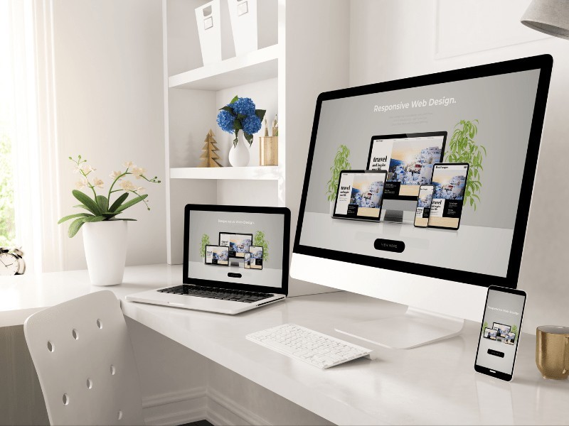
Make sure that your website scales properly, not just between mobile devices and computers, but across different screen sizes and resolutions. It’s great that a user with a large screen can clearly distinguish website navigation. What if they’re on a small screen? What if they’re using a screen reader? Accessibility is part of device support, and you want to ensure that every user has a chance to interact with your business.
Provide Meaningful Content and Repetition
Nothing on your website should be unnecessary information. It should be clear, concise, and readable. Avoid technical jargon and speak directly to the kinds of questions a potential customer asks about your business and services. Don’t be afraid of repetition, but make sure that your repetition serves a purpose – to help cement information into memory and highlight the most important aspects of what you’re offering consumers.
Have a User-Focused Layout and Navigation
How you layout your content and set up navigation is as important as the content itself. Users skim website content to look for information key to them, so an F-pattern is a good way to build content on your site, with clear headings and key points highlighted along the left side as people scroll down so that they can easily find points that interest them.
Meanwhile, provide clear navigation. This means having a navigation menu that clearly provides users with where they can find key information (About you, how to contact you, what services you offer, etc.). This also applies to having an easy-to-use search function on your site as well as clear links that can provide additional information in the text of your site.

Make Clear What You Want People to Do
The old adage, you don’t get the sale you don’t ask for, applies as much to web design as it does to direct sales. You don’t always have to be directly transactional (“buy now”) with your call-to-action, but you should be coy about them either. Visitors know why your website exists. Decide what actions you want people to take, and provide them with clear ways to take that action. Whether you want them to read the next article in your blog, check out your latest product offerings, or schedule an appointment with an administrator, it’s important that you use clear, concise language to bring them there. Place call-to-action links and buttons where they will stand out and use contrasting colors to help users see them.
Remember, Speed Matters
It’s vital that your pages load as quickly as possible (instantaneously to your visitor’s perception), but that may not always be in your control. How fast your pages load for a user will depend, in part, on their connection speed. It’s vital then that you design your pages so that they can load quickly, no matter the device or connection. Don’t make a potential customer wait on you. Make sure that your web page is free of unnecessary clutter and that video and image elements are in a format that loads quickly.
The page loading speed isn’t the only thing that matters. Your user’s “loading speed” should be fast as well. By having pages with a clear, consistent layout, you enable visitors to quickly find navigation and information. If your site is too cluttered or if key elements shift from one part of the screen to another from page to page, you’ll lose your visitors, and they won’t convert. Make visiting your site easy, comfortable, and fast to process, for both devices and people.

Are You Looking for an Expert Web Designer?
Media Components can help you build your website and customize your user experience. Whether you’re an entrepreneur starting out, a small business, or a large company, we have digital marketing solutions we can tailor to your needs. Contact us today.


