


Project Overview
AmeriBest Home Care needed a homepage experience that could clearly serve two very different audiences: caregivers looking for employment opportunities and individuals or families looking for home care services.
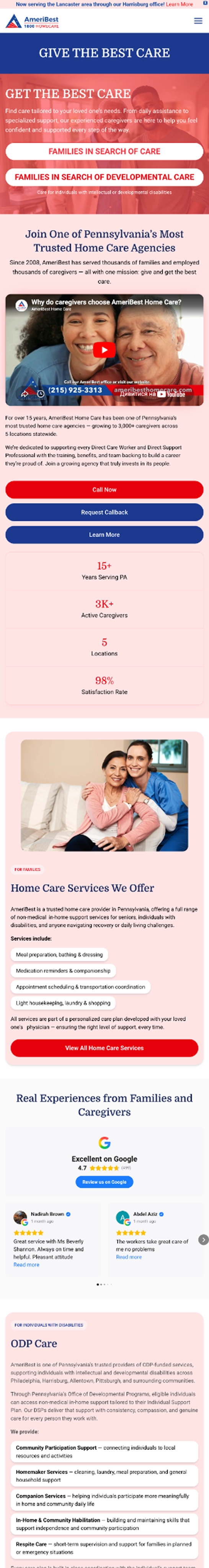
The previous homepage already used a 50/50 split hero section, with one side focused on “Give the Best Care” and the other focused on “Get the Best Care.” This split was an important part of the client’s direction and needed to remain in place. However, the rest of the page created a more complicated experience, with color-coded content sections for both audiences appearing together as users scrolled.
While the original concept was not wrong, it needed a more streamlined solution. Visitors were being asked to process two separate journeys at the same time, which made the page harder to follow even with the use of color coding.
Preserving the Split, Improving the Experience
A mandatory requirement for the redesign was to keep the 50/50 split hero structure. Rather than removing it, Media Components elevated the concept into a more modern, interactive, and polished user experience.
The redesigned hero keeps the split-screen approach but improves the overall presentation through stronger visual hierarchy, cleaner spacing, better contrast, and more intentional calls to action. The result is a homepage that immediately communicates the two available paths without overwhelming the visitor.
Before
After

A Clearer Path for Two Different Audiences
One of the most important improvements was separating the user journey based on visitor intent. When a user selects the “Give the Best Care” side, the website guides them toward caregiver-focused content. This path is tailored to home care workers and individuals interested in employment opportunities with AmeriBest.
When a user selects the “Get the Best Care” side, the experience shifts toward seniors, families, and individuals looking for home care services. This path focuses on care-related messaging and information that is more relevant to people seeking support for themselves or a loved one.
By allowing users to choose their path upfront, the site avoids mixing too much audience-specific content into one shared page experience.
Give the Best Care
Get the Best Care

Interactive Design That Feels Intentional
The updated split hero was designed to feel more engaging and refined. Interactive elements and animations were added to make the experience feel more dynamic without making it overly complicated.
The goal was not just to make the homepage look better, but to make the decision point clearer. The interaction gives users a more natural way to identify which side of the website is relevant to them, helping reduce confusion and improve the flow of the homepage.
Before
After
Streamlined for Desktop and Mobile
The split-screen concept also needed to work well across different devices. On desktop, the 50/50 layout creates a strong visual entrance point, giving both audience paths equal importance. On mobile, the experience was streamlined so users can still clearly understand the two options without the layout feeling crowded or difficult to use.
This helped preserve the client’s required concept while making the interface more practical and user-friendly across screen sizes.

Closing Summary
The redesigned AmeriBest Home Care homepage successfully keeps the required 50/50 split while transforming it into a clearer, more interactive, and more effective user experience.
Instead of presenting both audiences with overlapping content, the site now gives caregivers and care seekers their own focused paths. This creates a stronger first impression, reduces confusion, and makes the homepage feel more intentional from the first interaction.
The result is a modern homepage experience that supports AmeriBest’s dual-audience strategy while improving usability, visual impact, and overall engagement.